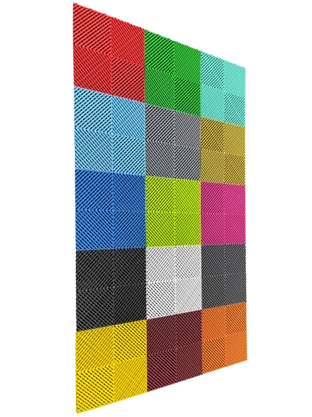
Strategic and Informed
Colour Scheme Selection for
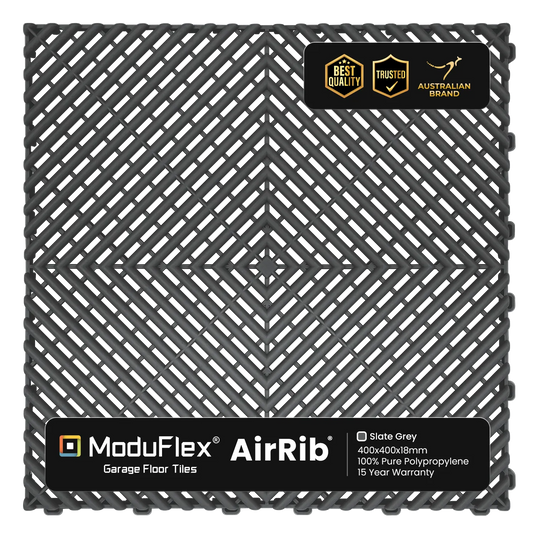
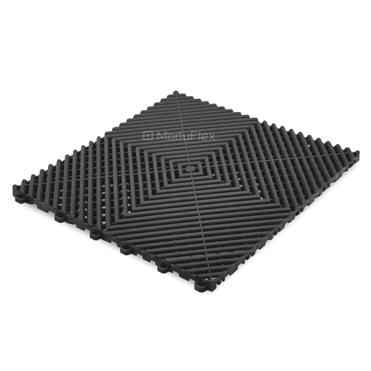
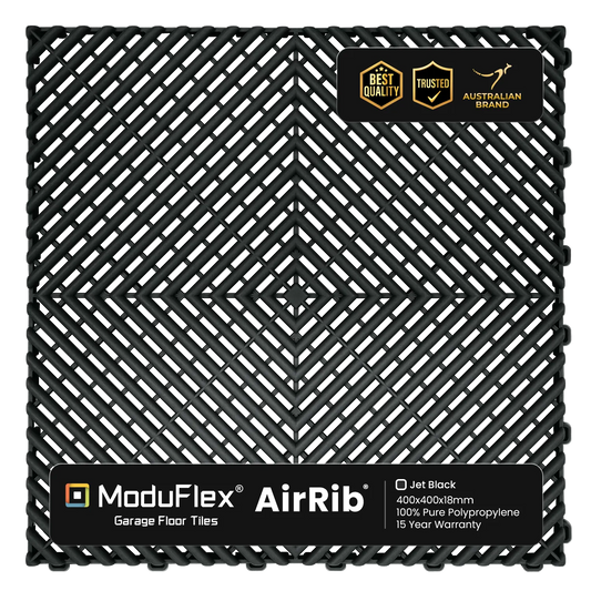
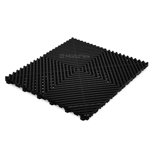
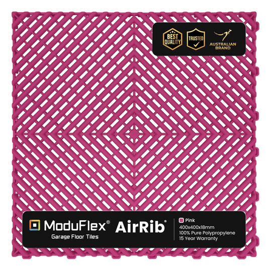
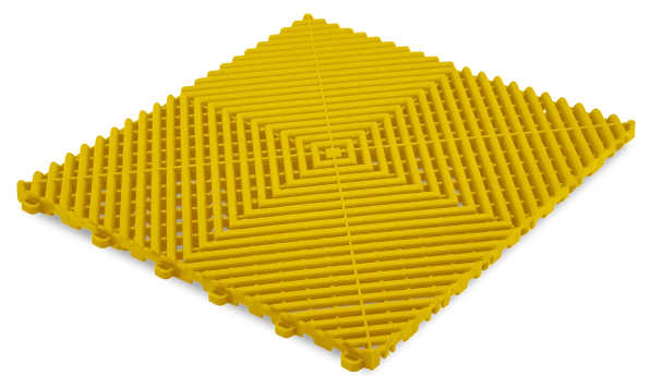
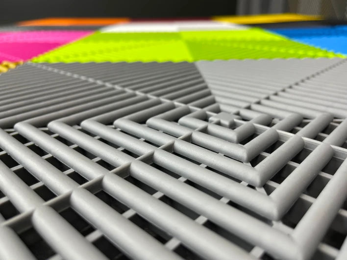
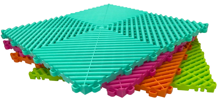
ModuFlex AirRib Tiles
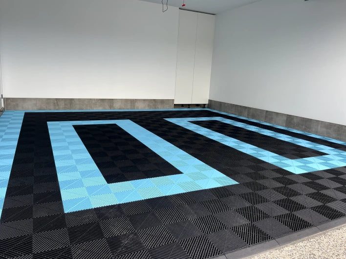
The selection of a colour scheme for your ModuFlex AirRib tiles is not just an aesthetic choice; it's a strategic decision that influences the mood, functionality, and overall feel of your space. This guide offers a comprehensive approach, blending design theory and practical considerations to help you make an intelligent and informed decision.
Comprehensive
Analysis of Your Space
Functional Analysis:
Assessing the primary function of the space is crucial. For example, a workshop or garage might benefit from darker, more forgiving hues that can hide stains and wear, while a recreational area could embrace brighter, more energizing colours. Understanding the purpose of the area will guide your colour choices effectively.
Spatial Dynamics:
Colours play a significant role in altering the perceived dimensions of a room. Lighter colours can make small spaces feel more open and airy, while darker tones can lend a cozy, intimate feel to larger areas. This understanding is essential in making your space not only visually appealing but also comfortable and suitable for its intended use.
Lighting Influence:
The way natural and artificial light interacts with colours can dramatically change their appearance. A colour that looks vibrant and lively in daylight might appear muted or different under artificial lighting. Therefore, it's important to consider the lighting conditions of your space when selecting your colour scheme.
Detailed Strategy for
Colour Scheme Development

1. Mood and Theme Establishment:
Determining the desired emotional atmosphere is the first step in colour selection. This could range from a calm and serene environment, ideal for relaxation and contemplation, to a vibrant and dynamic space that stimulates creativity and activity. The mood you aim to create will significantly influence your colour choices.
2. Base Colour: Informed by Science:
Selecting a base colour is more than just picking a favourite shade. It involves understanding colour psychology and how different colours can affect mood and behaviour. For example, blue is often associated with tranquillity and productivity, making it a great choice for an office or study, while yellow, known for its uplifting and energizing qualities, could be ideal for a gym or playroom.
3. Harmonious Colour Combinations:
The next step is to explore complementary colour combinations. This involves using the colour wheel as a guide to find colours that work well together, creating a visually appealing and balanced look. Whether you choose monochromatic shades, analogous colours for a subtle and cohesive look, or contrasting hues for a bold statement, understanding colour relationships is key.

4. Balancing Practicality and Aesthetics:
Consider how your colour choices will hold up in a real-world setting. For example, choosing a lighter colour for a high-traffic area might not be practical due to the visibility of dirt and wear. At the same time, it’s important to ensure that your practical choices still align with your overall aesthetic vision.
5. Seeking Real-World Inspirations:
Inspiration can come from various sources - nature, architecture, fashion, or art. Observing how colours interact in different environments can provide unique insights and inspire innovative colour pairings that you might not have considered otherwise.
6. Hands-On Experimentation
Before finalizing your decision, it's advisable to experiment with your chosen colours in the intended space. Use digital tools to create mock-ups or apply physical samples to see how the colours behave under different lighting conditions and alongside existing décor elements.
7. Confident Finalization:
After a thorough exploration and testing phase, confidently finalize your colour scheme. This final selection should be a harmonious blend of your personal style, the functional requirements of your space, and the principles of colour theory and design.
Conclusion
Selecting the perfect colour scheme for your ModuFlex AirRib tiles is an artful balance of aesthetics, psychology, and practicality. By adopting this detailed and strategic approach, you ensure your chosen colours not only enhance the beauty of your space but also contribute positively to its atmosphere and functionality.
- Choosing a selection results in a full page refresh.